Ranking the New NFL Alternate Helmets
October 6, 2022
Over the offseason, the NFL finally abolished its one-shell helmet rule. This change allows teams to wear alternate helmets over the course of the season, and many NFL teams have already taken full advantage of this long-awaited change. Of course, while some teams created a truly stunning alternate helmet design, other teams rushed the process and put out a helmet that left much to be desired. That’s why I must do my due diligence and rank each of the twelve newly released helmets from worst to first.
12. New Orleans Saints
This helmet came in dead last because there was very little the Saints could’ve done to mess it up. A simple black or white variation of their current helmets would have sufficed, but instead, they concocted a helmet with tiny Saints logos that will likely not match with any of their uniforms.
11. Houston Texans
This one’s a bit odd. It comes off as random and quite unnecessary, but what bothers me the most is that this “Battle Red” helmet looks like a different shade of red from their actual uniforms. It’ll probably look better from afar or on TV.
10. Arizona Cardinals
I was a fan of these at first until I saw them worn in their Week 2 preseason game. This is more of an “it’ll grow on me” type of helmet. Maybe I’m biased because I personally really liked their white helmets paired with their black rush uniforms.
9. Carolina Panthers
Now, this is a team that could use an alternate shell. With some of the cleanest sets of uniforms, the only thing Carolina was missing was another helmet to spice things up. This particular design doesn’t stand out to me in any way, but it’s not bad by any means.
8. New York Giants
Unfortunately, this is a top three helmet ruined by its pairing with a throwback jersey that’s a completely different shade of blue. It’s a real shame because the helmet alone is sleek, sharp, and supposedly resembles the Giants’ uniforms from the 90s. They may need to revert back to the lighter shade of blue they originally had if they want to complete the throwback look.
7. New York Jets
Much like Carolina, the New York Jets put out a decent helmet. The reason I gave the Jets a higher ranking is because I believe their helmets mesh slightly better with their current “Stealth Black” uniform.
6. Dallas Cowboys
These are really clean, and there are multiple options at play that America’s team can choose from. I especially like the helmet with their current logo on it and the uniform they pair it with compliment each other nicely.
5. Chicago Bears
Was an orange helmet necessary? Probably not. Is it a quality helmet design? Definitely! It’s pretty much an orange version of their current navy ones but well executed. The matte orange will pair nicely with their beautiful orange alternate uniforms. In the future, I’d be keen to see them mix up uniform combos with these helmets.
4. New England Patriots
I’m a fan of the throwbacks, and the Patriots’ AFL red jerseys are no exception. They’re unique, true to the classic, and look great in person, on TV, and anywhere in between.
3. Philadelphia Eagles
This might be controversial but I adore this alternate helmet—it’s exactly what Philly needed, and it’s executed to a tee. The speckled black adds a pleasantly interesting aspect to the helmet, and I, for one, am dying to see these in a primetime game this season.
2. Cincinnati Bengals
When the one-shell helmet rule was changed, everyone was waiting and hoping that the Bengals would release these exact helmets. Their current helmets are already a staple in the NFL, whether you love them or not, but finally pairing their “White Bengal” color rush uniform with a matching white helmet only makes sense.
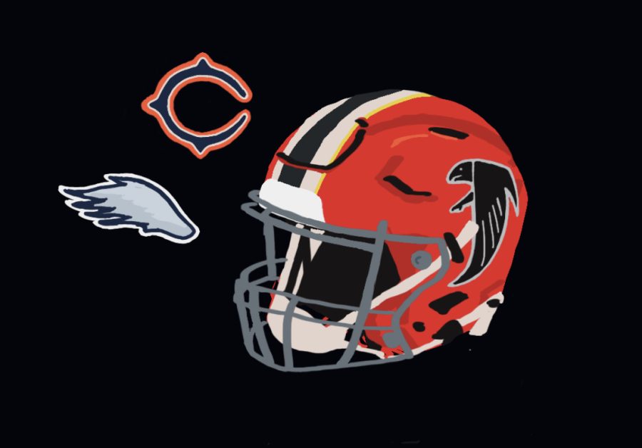
1. Atlanta Falcons
The Falcons knocked it out of the park with this one. I love throwbacks, and what I especially like about these is that they weren’t afraid to spice things up, even if the change was subtle. The thin metallic gold outlining the black and white stripe was a subtle change, and it’s the icing on the cake. Bonus points for having a similar logo to CRLS.
This article also appears in our September 2022 print edition.